Textures used:
Tuesday, 29 May 2012
Thursday, 24 May 2012
Interactivity
COCA COLA:
Coca Cola has always been interactive with the consumers by competitions, rewards and through technology over a long period of time. These not only increase the interactivity of consumers, but also have an advertising effect as it helps the consumers to become more interested about their products.
FACEBOOK:
One way how Facebook office in Menlo Park, California achieves interactivity is by this message board. It allows commuication between the business and employees, as well as between the employees to take place in a simple but effective way.
COCA COLA & FACEBOOK:
Coca Cola is a global company but it tries to interact with indiviual countries and one of the ways they achieve this is by Facebook. Since Facebook is a place where interactivity between people all over the world is possible, Coca Cola creates a page for different countries and even for different products to specifically promote a product applying to on going advertisement in the country.
Tuesday, 22 May 2012
Tuesday, 15 May 2012
Valley: Milford Sound, New Zealand
I had the choices of valleys in New Zealand and Korea, and in the end,
I decided on Milford Sound in New Zealand because not only it's a beautiful place,
but there are various scenaries such as waterfalls and the lava tube that
Milford Sound allows visitors to see all at once.
Crysis (In progress):
Saturday, 12 May 2012
Friday, 11 May 2012
Saturday, 5 May 2012
Cryengine upload
Even though I tried it several times, my level file couldn't upload, so I was only able to upload my latest cryengine folder.
http://www.gamefront.com/files/21660993/z3414266_
http://www.gamefront.com/files/21660993/z3414266_
EXP2 Final Submission
Rem Koolhaas's concept: Regular is irregular in terms of the use of tessellation.
Ludwig Mies Van Der Rohe's concept: Creating balance with seemingly unbalanced forms.
Electroliquid Aggregation: "The tessellation of irregular forms seemingly unbalanced creates a balance with the use of regularity in forms."
"In between Space"
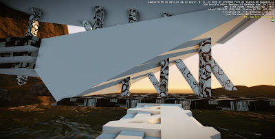
For the meeting place in the "In between space," I tried to make the design relate to the two monuments so that the three different elements will look like a whole instead of three seperate designs. I was able to achieve this by the criss cross pattern, which both monuments have on their facade. I included the two different criss cross patterns in the design, one pattern from each monument, so that it conveys the ideas of 'in between' and 'connection between two monuments.'
I tried to make the bridge related to other designs as well for the same reason as the meeting place of avoiding different designs to look unrelated and seperate from each other. The bridge design is very closely related to Rem Koolhaas's monument as it has a similar design except the bridge runs horizontally and is flat while the monument is vertically structured and rigid.

Friday, 4 May 2012
Development: Ludwig Mies Van Der Rohe monument cont.d
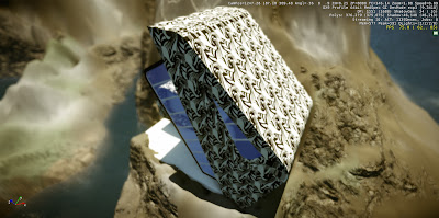
Final development of Ludwig Mies Van Der Rohe's monument in Cryengine:
This monument is stable by its structure but also by how the edges of the roof and the platform are fixed in to the environment, making a relationship between the monument and its surrounding environment. This is also a reason why how the monument can stand on a water surface and connect the cliff and the island together.
Subscribe to:
Comments (Atom)


+photoshopped.jpg)
+photoshopped.jpg)


